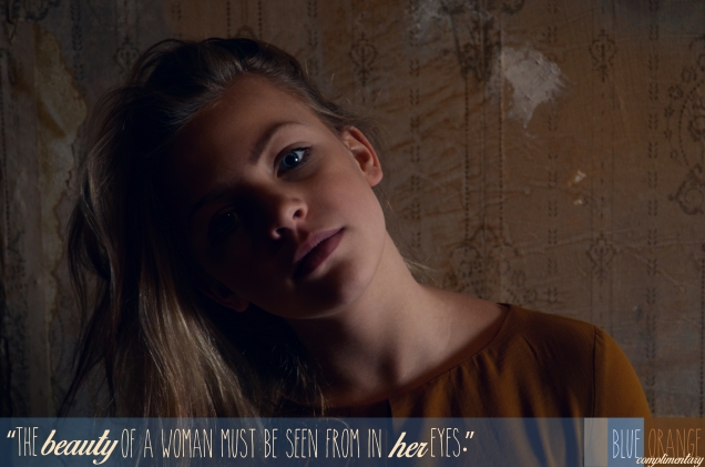
Description: Creating an image using good photography skills, with design elements, text, and an evident color scheme.
Process: I grabbed my boyfriend’s beautiful little sister and took her up into the attic of woodman’s ballroom to take my photos. I used my Nikon d5100 with a 18-50 mm lense and 4.6 fstop. I wanted her to look very raw. No makeup, very plain dress. This all was to emphasize my message. I then entered my photo into photoshop and played with the levels (RGB levels as well as Red, Green, and Blue levels). I also took the saturation down a tad as well as sharpened the photo. I then added my blocks of color. I decided to take down the opaqueness on all my design elements as to keep the design subtle and soft to balance the dramatic lighting. I then entered in an Audrey Hepburn quote and color swatches.
Message: I wanted my photo to send a message of natural beauty and healthy self image. The quote is to help women realize they need to see their own beauty.
Audience: All women and girls.
Top Things Learned: I learned that I need to work on my use of font.
Color Scheme: Complimentary; Orange and Blue
Title Font: The Skinny
Copy Font: Birds of Paradise Regular


