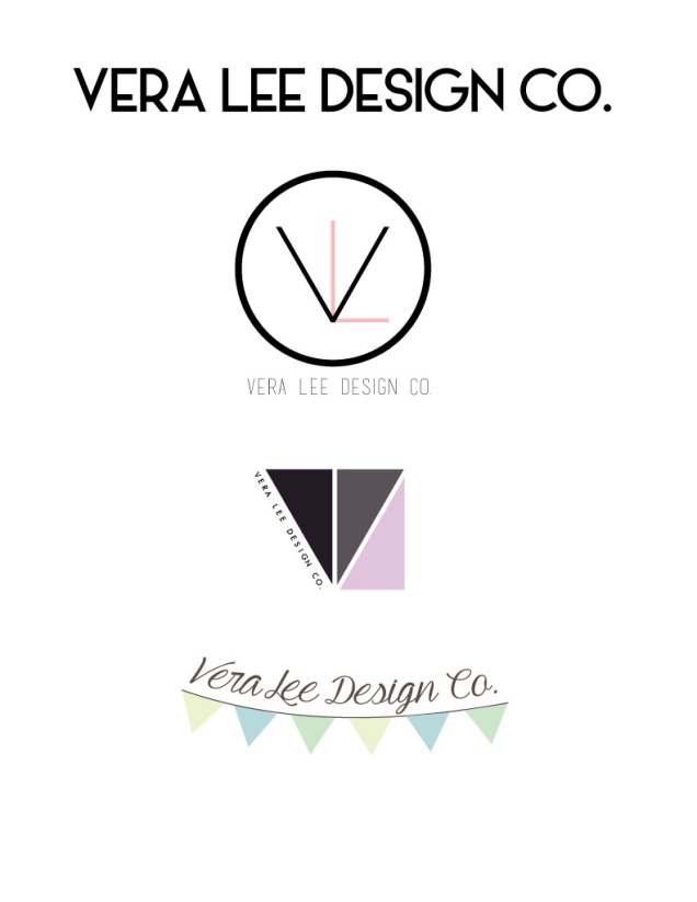
- Description: Three completely different logos for the same company.
- Process: The first thing I did was go online and look for inspiration. I found quite a few styles I liked. The first vibe I went for was very modern and high fashion. I used both the circle shape tool as well as the rectangle tool for the V and L. I then found a font on dafont.com for the name of the company. For my second I was going for more of a professional look. I based the design off of the V and L from the first design but turned them into shapes. I used the rectangle tool to make the V and L then made them whit4e so they would disappear. I then used the paint bucket tool to fill in the areas between my rectangle to make the triangles. My last design was a little more shabby chic. I love the look of a banner and wanted to incorporate it into my design. I used the star shape tool and made copies so I had several of the same triangle. I then used the pen tool to create the string of the banner. All my fonts are from dafont.com.
- Message: Each design has it’s own message. The first is of modernism. The second is of professionalism. And the last is of chicness.
- Audience: All people who need a modern designer.
- Top Thing Learned: Oh my goodness. I learned so much on this project. I learned a completely new program that I had never even touched. I learned how to apply the things in my mind into digital form.
- Three Color Scheme and Color Names: Monochromatic, Red. Monochromatic, Indigo. Triadic, Blue, Green, Lime.
- Three sets of Title / Body Font Names & Categories:
- Title Font: Basic Title Font (only one font)
- Title Font: Futuristic Fixed-Width (only one font)
- Title Font: Sweet Pea (only one font)
- Votes on favorite logo:
- 6
- 1
- 4
- Top Logo = 1 ; Middle Logo = 3 ; Bottom Logo = 2 ;
- My favorite logo is number 1.
- Comment
- Reblog
-
Subscribe
Subscribed
Already have a WordPress.com account? Log in now.

Hey Hailey!
I really liked your logos, specially the top and bottom one. The top one is simple and looks professional; it really stands out in my opinion. The last one I really like the color scheme you chose; you gave it a homy feel to it; it reminds me of something “Country Living” would choose for their website or advertising department. Overall I think you did Great.
Check out my logos!
Also, check out Chase’s logos, you can get some inspiration from his designs:
LikeLike
Hey Haley, I love every one of your logos. Specially the third one since it’s very colorful and the fonts also go along with your image. Additionally, your first logo has an interesting combination of colors as well. You used the right color scheme for this one and I liked it too.
LikeLike
I love all of your logos! I think that you did such a good job of keeping them all very different but relating it all back to your company. I like all your colors that you chose as well. I really like the first one and think that you did a good job of designing it. Overall your logos are amazing and I love them, good job!! Check mine out at https://isabelbezzant.wordpress.com/2015/02/22/project-5-logos/
LikeLike
I think your colors here are fantastic! I love all the clean lines you used, too! They make it feel very sophistocated. Your designs are very creative, and they are very modern! I like them all a lot! Check out my project at marketingjamiemurray.wordpress.com if you get a second!
LikeLike
I think your colors here are fantastic! I love all the clean lines you used, too! They make it feel very sophistocated. Your designs are very creative, and they are very modern! I like them all a lot! Check out my project at marketingjamiemurray.wordpress.com if you get a second!
LikeLike
Hailey I really liked the simplicity of your logos. Number one is my favorite too. I think all of them express what you are trying to say and they are not too busy. great job.
Check out what I have done at. https://thehighlifeofdennis.wordpress.com/2015/01/07/2/
LikeLike